Books & Spreads
The Zenith of Zines


Teen Beat
Life
National Geographic
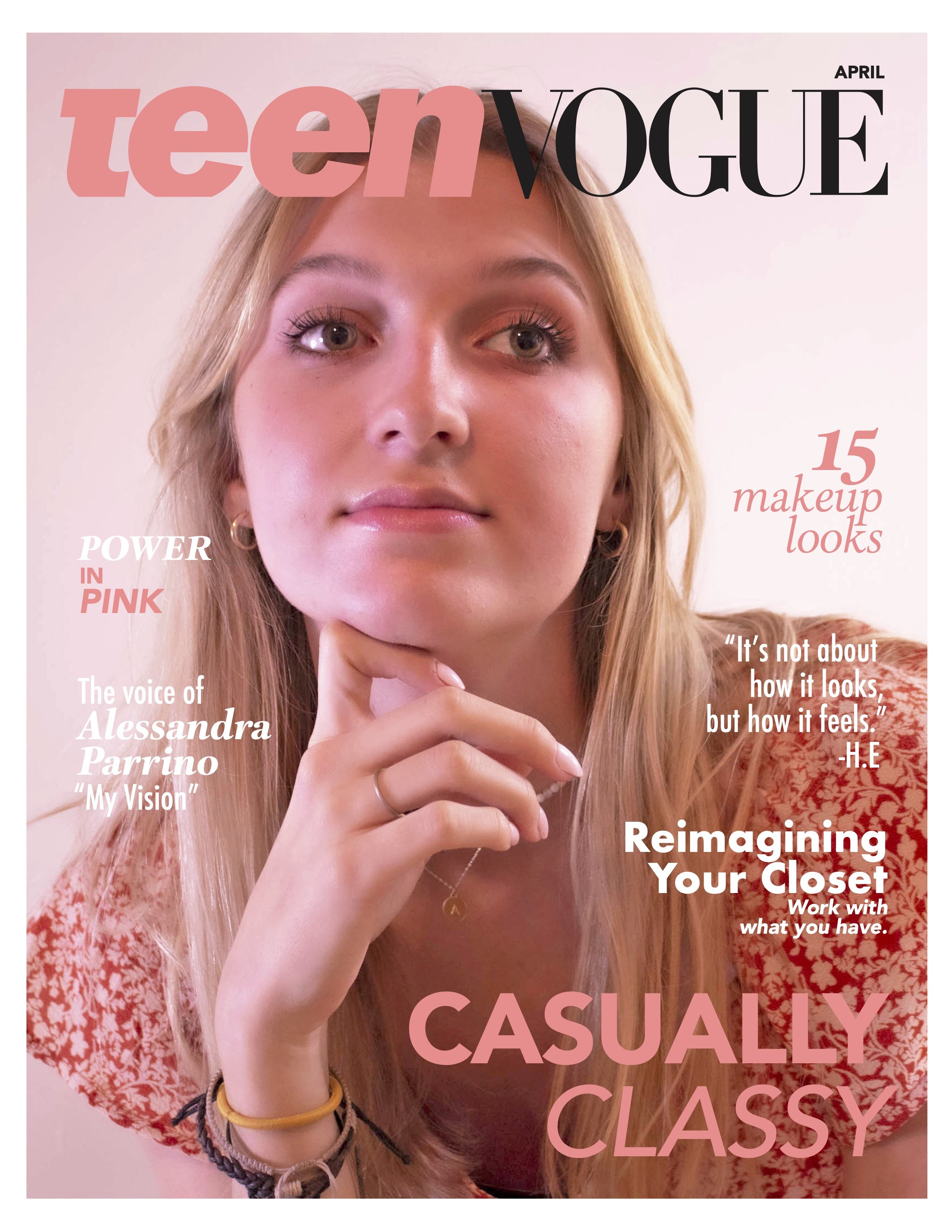
Teen Vogue
Different magazines provide different styles of photography and design. I researched styles of Teen Vogue, National Geographic, Life, and Teen Beat and incorporated a bit of myself within these designs. Designing a spread that is reminiscent of a chaotically girly approach was my favorite to design because my teen self would fall in love with the article.
Oh No, Our Humor.
It’s Broken

A Typographic Meme Book
“Oh, no. Our table. It’s broken.” That is one of many common videos/sounds used in memes. It may not mean anything to some. It could even be so absurd that the phrase creates the slightest bit of laughter. Absurd references are found throughout the meme culture with generation z, the 1998-2005 kids. What makes these phrases so appealing is that the weirder it is, the funnier it is. It’s unexplainable. It is simply, it is what it is. Sometimes the absurd humor can even become relatable, we can install whatever meaning we seek. One can find comfort in the illogical. As for a generation of young adults who have experienced times of war, chaos, a pandemic, school shootings, etc., it seems like nothing else can phase this generation.
Except for a broken table.


Revival
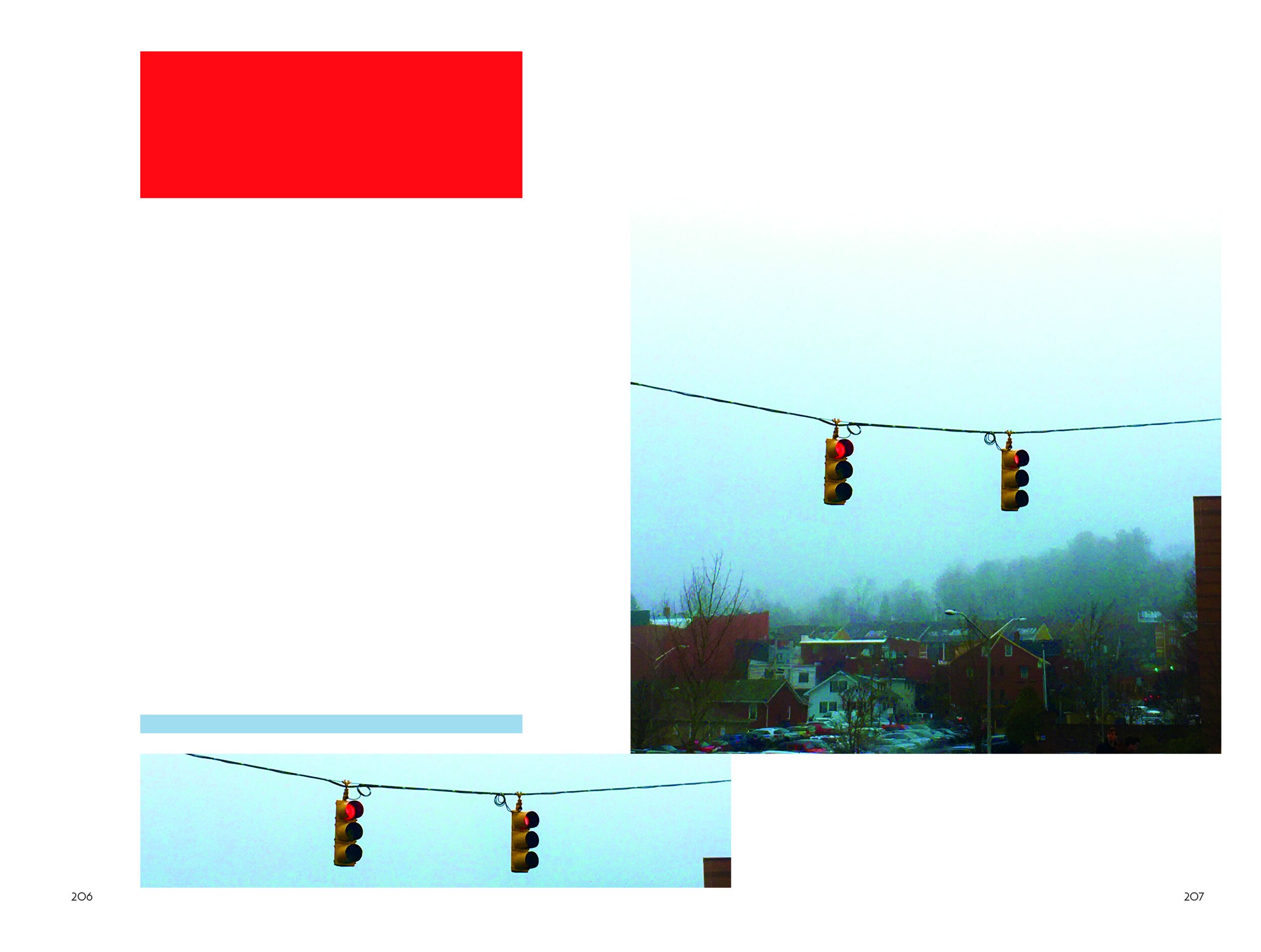
Fragments of my Timeline
A 500 Page Book.
“Speaking of change, I have actually rewritten, adjusted, and added new text to this preface. My thought process keeps shifting as I progress closer and closer to the publishing phase. Even though this may sound extremely cheesy, in a way I see a moral emerging. This book is a sentimental marker for reflection in the next coming years. Big changes will be coming my way and I hope I look back with just as much value as I had compiling all these fractions of time.”
- Yesenia (Sept 2021)


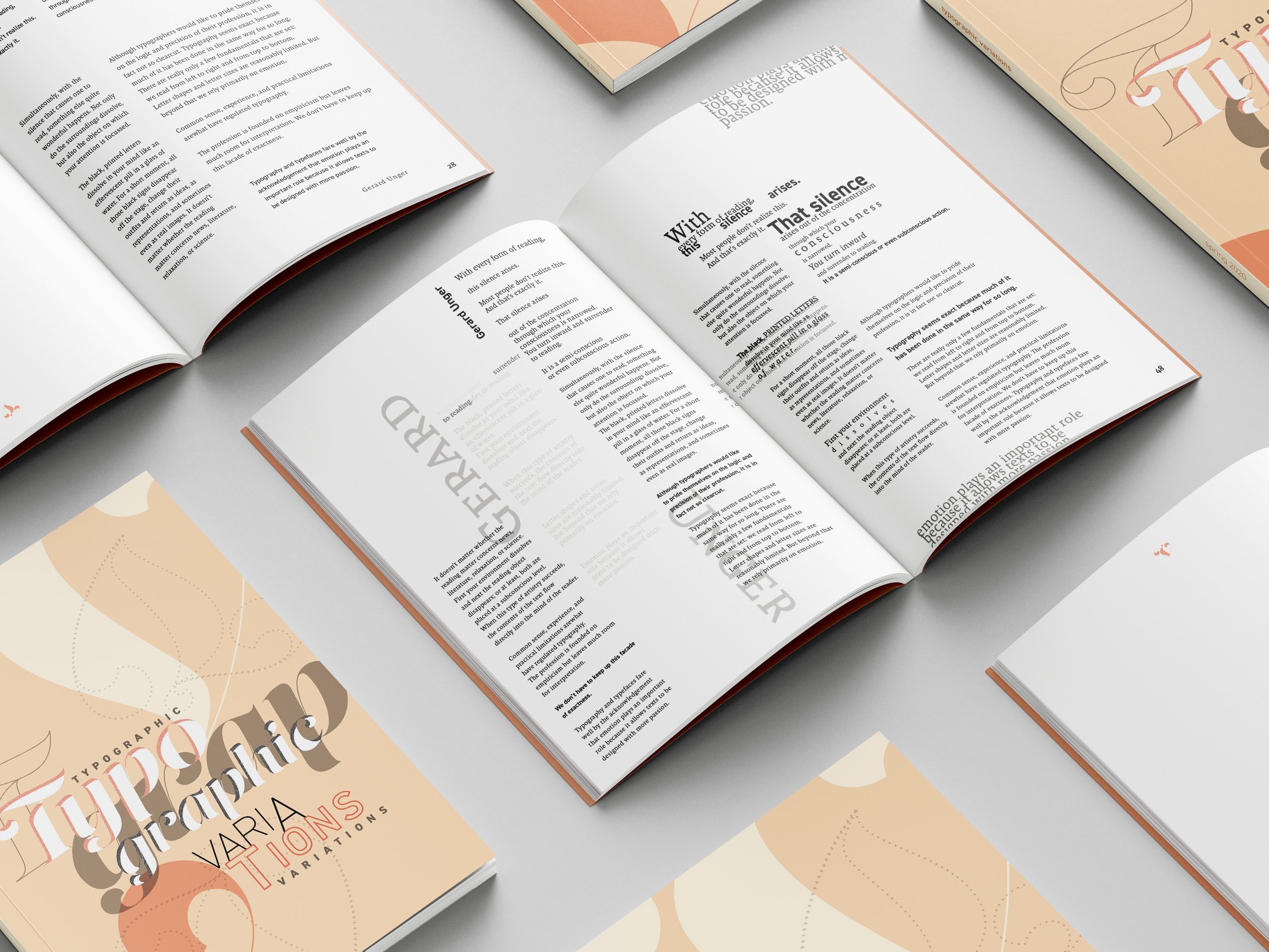
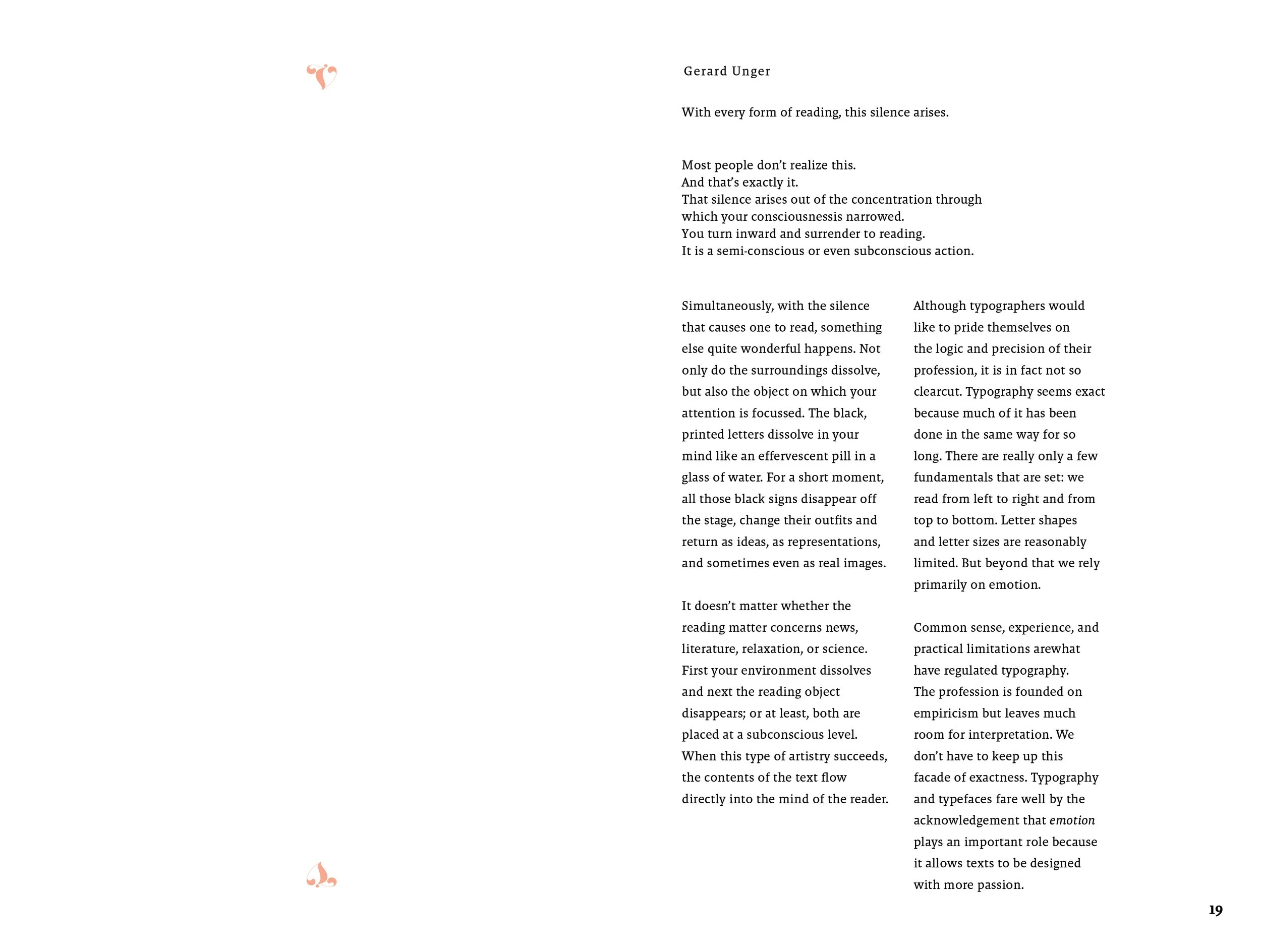
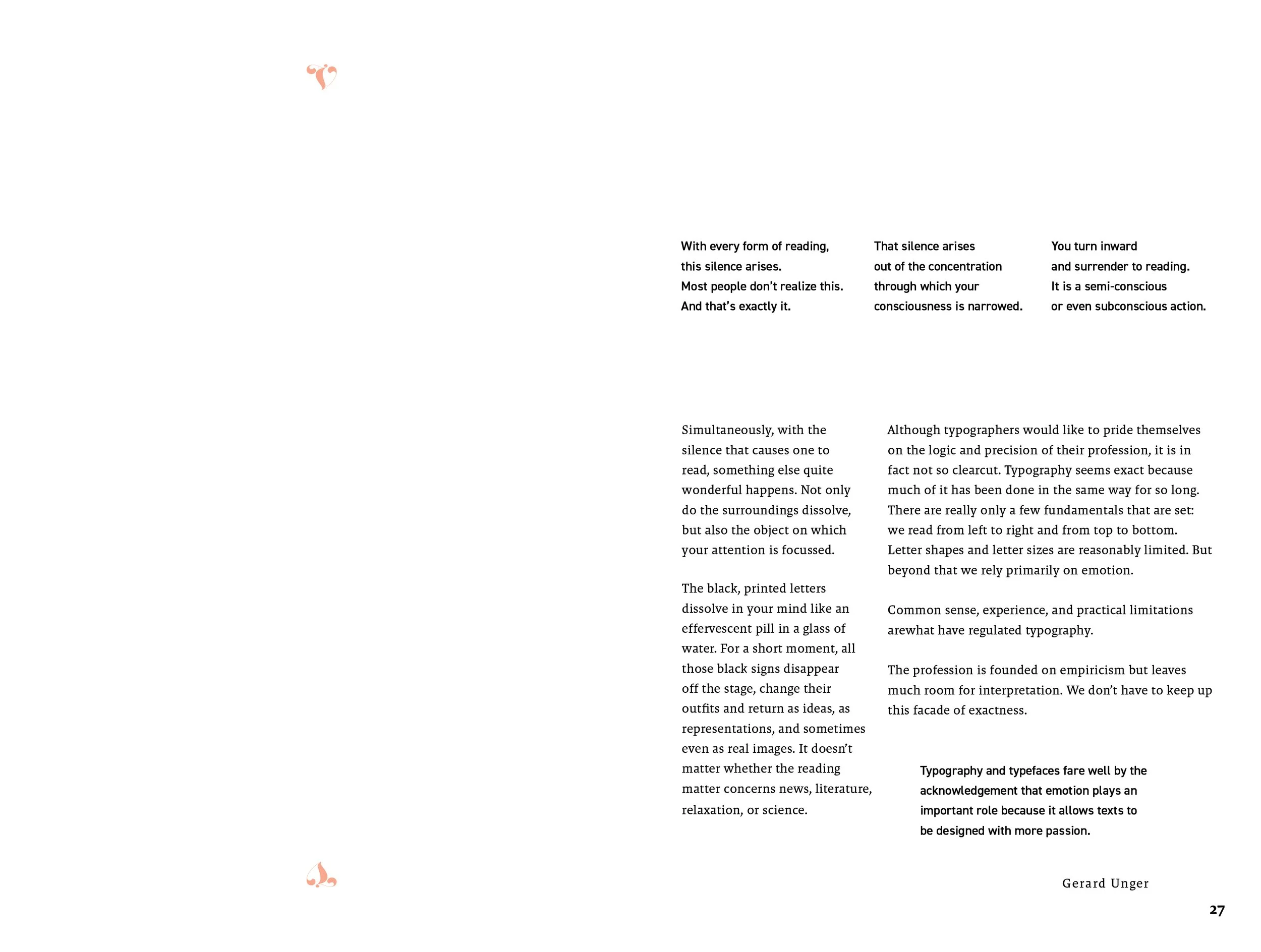
Typographic Variations
Type Exploration
Each week I had to design several layouts for each variation. As the weeks progressed, the parameters increased (leading, kerning, weight, style, and imagery). Therefore I was able to be more flexible with limitations. The two consistencies were my typefaces, Malaga & Din, and the select essay written by dutch graphic designer, Gerard Unger.


ROP
A Reflection on Practice
Each week I had to choose a piece of writing to read and reflect on within my own writing. My text was then designed into a spread that speaks for what I wrote in a visual manner. A total of 10 spreads were compiled in the end.
“It feels great knowing I managed to pull everything all together in the end because I was a little bit concerned how I was going to pull this off. Although there were doubts, I am very proud of myself for sticking with the ROP schedule and always cranking out a design during such stressful times. It genuinely feels like I have reached yet another finish line, but sadly the race isn’t over yet. Nonetheless, that doesn’t mean there isn’t room for celebration, so please enjoy the voice I have crafted within this book.”
- Yesenia (Nov 2020)


Drebitko Collection
This collaborative project took on the form of a mock brand design experience. One person was the client, one was the creative director, and the other a junior designer. I was the creative director and my client was a graduating senior who needed his projects compiled in a portfolio book. Me and the junior designer brainstormed and executed concepts which took on the form of a modular puzzled grid.


See More